
Pie Chart Maker: Create, Customize, and Download Free Pie Charts
Turn your numbers into a clear pie chart in seconds. Add your data, pick your colors, and download a chart that’s ready for your presentation, report, or website. This free pie chart maker needs no design skills and no software to install.
What Is a Pie Chart?
A pie chart is a circular graph divided into slices, where each slice shows the size of one category compared to the whole. The bigger the slice, the bigger that category’s share of the total.
Pie charts date back to the early 1800s and remain one of the most recognized ways to show how parts add up to a whole. Budget breakdowns, market share, survey results, and demographic splits are all common uses today.
Pie Chart Rules Worth Following
Before you make pie chart visuals from your own data, a few rules separate a chart that communicates clearly from one that confuses people.
This tool applies these defaults automatically, so your chart is readable from the first version you build.
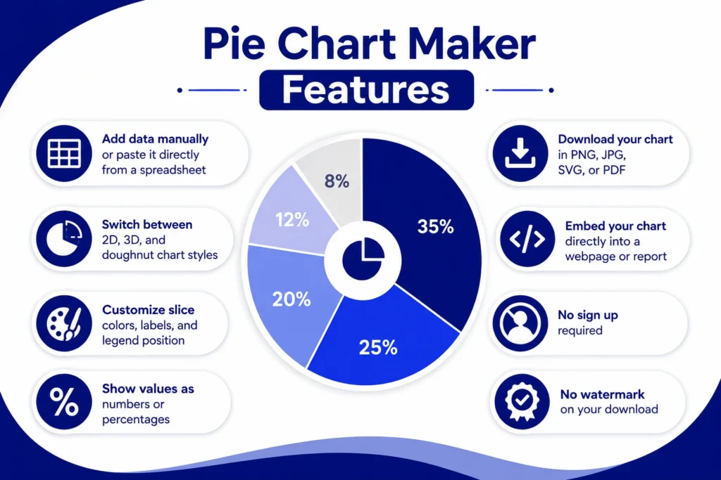
Pie Chart Maker Features
How to Make a Pie Chart
Making a pie chart takes four simple steps.
Add and Edit Your Data
Type in your labels and values, or paste them straight from Excel or Google Sheets. Your chart updates instantly as you type, so you can see the result before you finish entering your numbers.
Adjust Colors and Style
Change the color of each slice, update the font, and move the legend wherever it looks best. Add a title and adjust label sizes so the chart matches your presentation or report.
Switch Between 2D, 3D, and Doughnut Charts
Pick a flat 2D pie chart for a clean, simple look, or switch to 3D or doughnut style for more visual depth. If accuracy matters more than style, stick with 2D since it avoids the distortion that comes with 3D slices.
Export or Embed Your Chart
Download your chart as a PNG, JPG, SVG, or PDF. If you’re publishing online, grab an embed code and drop your pie chart straight into a blog post, dashboard, or webpage.
Import Data from Excel or Google Sheets
Already have your numbers in a spreadsheet? Copy your data from Excel or Google Sheets and paste it directly into the tool, and your pie chart builds itself. This saves time if you’re working with data you’ve already cleaned up or calculated elsewhere.
Collaborate With Your Team
Working on a report with others? Share your chart link so teammates can review it, suggest changes, or grab the latest version without passing files back and forth over email.
Pie Chart Templates
Not sure where to start? Choose from ready made templates built for common use cases like budget tracking, survey results, and sales breakdowns. Pick a template, swap in your own numbers, and adjust the colors to match your brand.
Real World Use Cases
Pie charts show up across almost every field, including:
Pie Chart Maker vs Excel, Google Sheets, and Canva
How Do I Make a Pie Chart in Excel?
Excel can build a pie chart, but it takes several steps: select your data, open the Insert tab, choose the pie chart option, then manually format colors, labels, and the legend. It works, but formatting a clean looking chart often takes more clicks than it should.
How to Make Pie Chart in Google Sheets
Google Sheets follows a similar process. Highlight your data, go to Insert, select Chart, then switch the chart type to pie from the sidebar. Like Excel, customizing the design takes extra time once the chart is created.
Canva Pie Chart Maker
Canva offers a pie chart maker built into its design editor, which works well if you’re already designing a graphic or presentation inside Canva. If you just need a chart on its own, without opening a full design project, a dedicated pie chart maker gets you there faster.
This tool gives you the same result as Excel, Google Sheets, or Canva, without the extra steps. Paste your data, adjust your design, and export. No spreadsheet formatting and no separate design account required.